Comparing temperatures: past and present
How accurate are our historical temperature records?
In 2021 Bugatti released their Chiron Super Sport 300+. The “300+” is because it is the first road-legal car that has reached speeds above 300mph, although production models are electronically limited to 271mph.

This car can accelerate to its top speed of 490km/h in around 40 seconds and can come to a complete stop from that speed in less than 15 seconds.
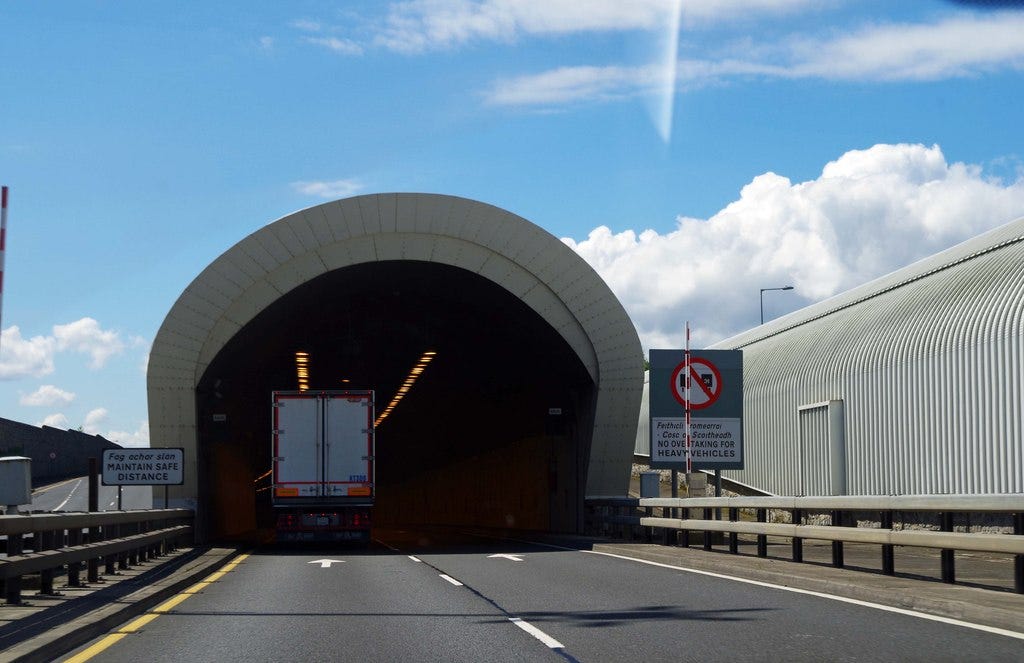
The Dublin Port tunnel was opened on 20th December 2006. Technically there are two 4.5km long tunnels, one for each direction of traffic.

The walls of the tunnel are hard, unlike surface level motorways which have flexible safety barriers. Crashing into the walls at high speeds would be not only fatal for those involved in the crash but could also potentially damage the tunnel’s structural integrity.
To encourage people to respect the 80km/h speed limit, average speed cameras have been installed. An average speed camera system consists of at least two cameras (but ideally more) distributed over the region where the speed limit is being enforced.
The cheap option would be two cameras on each tunnel, one at the start and one at the end. If the timestamp of your car passing the second camera is less than 202.5 seconds after you passed the first camera then you have travelled the 4.5km at an average speed faster than 80km/h and a speeding ticket and penalty points for your license will follow.
The better option is to have more than two cameras distributed along the tunnel to prevent any reckless and idiotic Chiron Super Sport 300+ driver from attempting the following…
Enter the tunnel at a rolling 80km/h start
Put your foot down and reach the top speed of 490km/h after about 33.5s
Hold top speed for about 1.5s
Break hard to 30km/h over 3.5s
Keep to 30km/h for the remaining 164s of the journey
Because that takes exactly 202.5 seconds, if the Dublin Port tunnel only has two cameras installed per tunnel, the average speed is 80km/h even though the car’s speed varied between 30km/h and 490hm/h!
“Stephen, what exactly have the Bugatti Chiron Super Sport 300+ and the Dublin Port tunnel got to do with comparing past and present temperatures” I hear you ask. Please stick with me. I hope that it will make sense by the time you reach the end.
The thermometer is a relatively recent invention. While Galileo was messing about with thermoscopes as early as 1603, it would take until 1724 when Daniel Gabriel Fahrenheit proposed his thermometer scale before the idea of standardized temperature scales would take off. That René-Antoine Ferchault de Réaumur and Anders Celsius proposed different and competing standards in 1732 and 1742 should be unsurprising to anyone familiar with how standards work.
Unfortunately for Réaumur, his choice of 80 degrees between freezing and boiling points of water didn’t catch on.
Most of the world now uses the Celsius scale, though with the 0°C and 100°C points reversed from Anders’ original proposal, with only the United States, the Bahamas, the Cayman Islands, Palau, the Federated States of Micronesia and the Marshall Islands using Fahrenheit.
Our earliest actual temperature measurements, especially those from before 1732, rely on people either having later cross-calibrated the thermometers they originally used with other ones, or having documented their own choice of reference.
It also took a while for people to figure out how to measure the temperature. Most of the early measurements are actually indoor measurements from unheated rooms recorded once a day. Eventually it was figured out that measuring the outdoor temperature required the thermometer to actually be outside and shaded from the sun.
It would be 1864 before Thomas Stevenson would propose a standardised instrument shelter and after comparing with other shelters his final Stevenson screen design was published in 1884.
While we may laugh now at people who measured the outdoor temperature with a thermometer located in an indoor unheated room, because the room has a large heat capacity, that is it takes a while to both heat up and cool down, taking one indoor measurement a day is actually not that bad a way to measure the average outdoor temperature.
When you move your thermometer to a well-ventilated outdoor shelter such as a Stevenson screen, the thermometer will change much more rapidly. If you want to measure the average temperature you will need to take multiple readings throughout the day and night.
In 1780, James Six invented a thermometer that keeps track of the maximum and minimum temperature since it was reset, though as it relied on mercury to move the markers, it can have issues in cold temperatures. By 1790 Daniel Rutherford had developed designs for separate minimum and maximum thermometers that used alcohol and mercury respectively and allowed for greater accuracy of both readings.
It would take until the 1870’s before minimum and maximum thermometers would be widely used to track the variability of temperature. For example the Central England Temperature history, the longest temperature record, is based on observations for a variety of hours prior to 1877 with daily minimum and maximum temperatures used thereafter.
Meteorologists use the daily minimum and maximum temperatures to estimate the daily average temperature by just averaging the minimum and maximum. This is called Taxn and the formula is: Taxn=(Tmax+Tmin)/2.
Do not get me wrong, if all you have is the daily minimum and maximum temperatures, averaging the two is the best guess you can make, but it is not the average daily temperature called Tavg which you get from measuring the temperature ideally more than 20 times evenly spaced throughout the 24 hour period and averaging all of those results.
Here’s where the Bugatti Chiron Super Sport 300+ and the Dublin Port tunnel come back in. If I told you the top speed of the Bugatti in the tunnel was 490km/h and it never went slower than 30km/h, if we used the Meteorologists’ algorithm we would conclude that it was travelling on average at (490+30)/2=260km/h. Yet we know from earlier that it is possible for those two limits to result in an average speed of 80km/h.
If you work it out, keeping the minimum and maximum speeds in the tunnel at 30km/h and 490km/h it is possible to get an average speed anywhere between 71km/h and 332km/h. While the Meteorologists’ 260km/h average speed is in that range, the range is quite wide.
To give another example of how the Meteorologists’ method can give an estimate that is quite a bit off, according to the Irish Central Statistics Office, in 2022 the top 1% of workers earned at least €3,867 per week. In contrast the bottom 1% of workers earned at most €92 per week. The mean weekly earnings were €856 per week and only 27% of workers earned at least that with the median weekly earnings being €671.

If we take the average of €3,867 and €92 that’s €1,980 per week. Less than 6% of earners received at least €1,980 per week which puts the Meteorologists’ average quite a bit off for estimating earnings or the average speed of a Bugatti through the port tunnel.
In the 1970’s, with the advent of cheap computers, it became possible to automate temperature measurement. A computer has no choice, if we tell it to measure the temperature every hour or every 5 minutes, rain or shine, sleet or snow, the measurement will be recorded. As most of the weather stations transitioned to automated measurement, mostly in the period 1990-2010, we are now able to measure the true average temperature, Tavg.
Valentia Observatory is 1km west of Cahirciveen, Co Kerry and a weather station has been operated in the area, with some temperature records for 1850-51 and continuous daily min-max records since mid-January 1872. The historical data sets have been carefully transcribed and are available from Met Éireann, 1850-1920 and 1921-1943. In 1944 Met Éireann did something a bit unusual, they started measuring the temperature every hour. Rain or shine, sleet or snow, the diligent staff of Met Éireann would go out to the weather station and record the temperature. Between January 1944 and April 2012 when the station was replaced with an automated station only 2 hours were missed. The data set from 1944 onwards is available from the Irish Government website: daily summary (includes minimum and maximum temperature) and hourly measurements.
Because we have an overlap of measurements from minimum and maximum thermometers and the 24 hourly measurements for Valentia, this means we can check just what the difference is between Tavg and Taxn to see how accurate the Meteorologists’ method of estimating average temperature from Tmin and Tmax is.
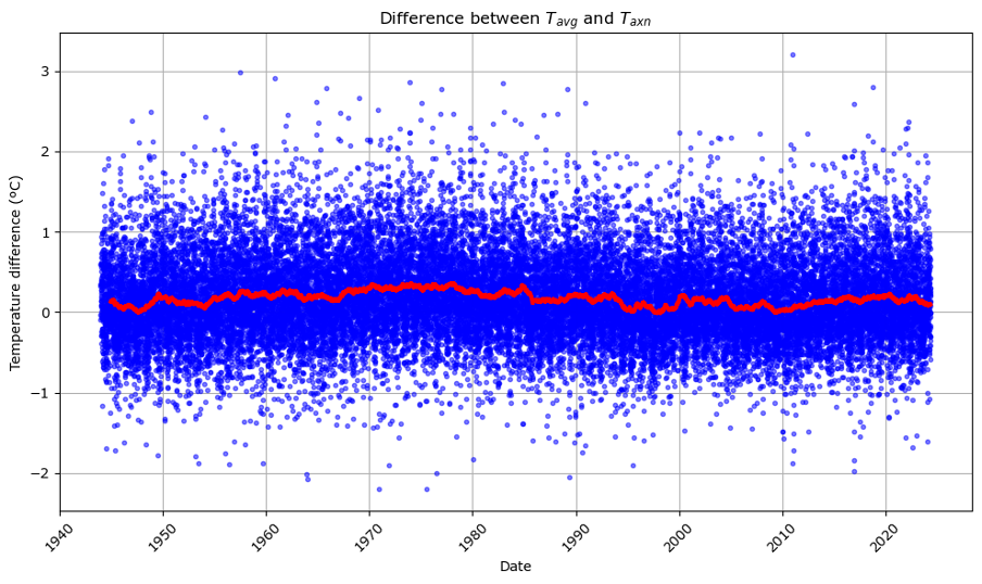
This first graph shows the difference Tavg-Taxn for every day since 14th January 1944 plotted as blue points. Overlaid is the 1 year rolling average as a red line. If you are interested in the statistics, Tavg is greater than Taxn in Valentia on average by 0.17ºC (std deviation 0.53, N=29339, min=-2.20, max=3.20).

If we just look at the rolling average, you can see that the relationship is not constant, for example in the 1970’s the average temperature was on average 0.35ºC warmer than the Meteorological estimate, while in the late 1940’s, 1990’s and 2000’s there were occasions where the Meteorological estimate was slightly higher that the actual average daily temperature.

It’s important to highlight that this multi-year variability is both unexpected and intriguing, particularly for those examining temperature anomalies. However, putting aside the multi-year variability, by squeezing nearly 30,000 data points onto the x-axis we may have hidden a potential explanation why the blue points typically show a spread of about ±1ºC… Is ±1°C spread seasonal variability?
The shortest day of the year in Valentia is December 21st when the day lasts for approximately 7h55m. The longest day of the year is June 21st when the day lasts for 16h57m. On the shortest day of the year there is little time for the sun to heat up and most of the time it is dark and we expect heat to be lost. So we expect the average temperature to be closer to the minimum temperature during the winter than during the summer.
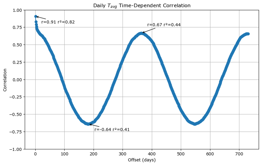
We can check the seasonal effects in the difference between Tavg and Taxn by looking at a time dependent correlation. As not everyone will be familiar with this kind of analysis, I will start by showing you the time dependent correlation of Tavg with itself:

The x-axis is how many days there are between measurements and the y-axis is the Pearson correlation coefficient, known as r, which measures how similar measurements are averages across all the data. A Pearson correlation coefficient of +1 means that the changes in one are exactly matched by changes in the other, a coefficient of -1 means that the changes are exactly opposite and a correlation coefficient of 0 means that the two variables have no relationship to each other.
The first point on the x-axis is for 1 day separation between the average temperature measurements.
The laziest weather forecast is the following:
“Tomorrow’s weather will be basically the same as today’s”
The r value of +0.91 for 1 day separation is an illustration of the accuracy of the laziest weather forecast and suggests that for average temperature it is approximately 82% accurate.
If we move out to half a year separation, we get an r value of -0.64 which says that 6 months from now, 41% of the average daily temperature can be explained as the opposite of today’s.
At a year separation the r value of 0.67 days that 44% of today’s average temperature can be explained as seasonal for this time of year. What this means is that actually the laziest weather forecast is only explaining 38% better than the seasonal forecast
You see very similar graphs if you look at the time-dependent correlation of the Tmax, Tmin or indeed the Taxn, with the 1 day r values being 0.90, 0.81 and 0.90 respectively and the seasonal swing being approximately -0.6 to +0.6 for 6 months and 1 year.
The above graph basically tells us what to expect when something is strongly seasonal.
What happens when we plot the time-dependent correlation of Tavg-Taxn? Well you get this:

The 1 day correlation is 0.19, this tells us that approximately 4% of today’s correction factor between Tavg and Taxn can be predicted if we know yesterday’s correction factor. The seasonality is even worse, the 6 month correlation coefficient is -0.02 and the 1 year correlation coefficient is +0.07.
This answers our earlier question… The ±1°C spread is not seasonal variability.
What this means is that if we only know Taxn then Tavg could be anywhere ±1°C.
Here is another graph to illustrate this. The x-axis is Tavg and the y-axis is Taxn. Now obviously when the average daily temperature is higher, the average of the minimum and maximum temperatures is also higher and so we get a straight line of slope 1, but the thickness of the line represents the uncertainty of the relationship, so if we know Taxn is say 15°C then from this graph we can say that Tavg is probably between 13.5°C and 16.5°C.

Now because most weather stations were not recording hourly until recently, most of our historical temperature data is the Taxn form and not the Tavg. That means that if Valentia is representative then the past temperature records are only good to ±1°C. If somebody tells you that the average temperature in Valentia on the 31st of May 1872 was 11.7°C, the reality is that we just do not know. It’s 95% likely to have been somewhere between 10.6ºC and 12.7ºC and we have no way of knowing just like knowing what the maximum and minimum speeds of the Bugatti through the port tunnel doesn’t really tell us much about its average speed.
In this last graph the blue points show the average Taxn of each year at Valentia since 1873 with vertical error bars showing the 95% confidence interval. The red points show the average Tavg for each year starting from 1944 with error bars showing the annual variation. The blue poking out from under the red shows the difference, even on the scale of a yearly average between the Meteorologist’s estimate of average temperature and the actual average temperature.

Valentia Observatory is one of the best weather stations globally. With the switch to automated stations in the 1990s, we can now get precise average temperatures.
Thanks to the meticulous efforts of past and present staff of Valentia Observatory and Met Éireann, we have 80 years of data which allows comparison of the old estimation methods with actual averages.
The takeaway?
Our historical temperature records are far less accurate than we once believed.
