Masking, models and reality (part 1)
What do SEIR models predict about interventions like mask mandates and how do those predictions compare to what actually happened?

This is the first in a short series of posts:
Part 1: What are SEIR models?
Part 2: What do SEIR models predict will happen if R₀ changes?
Part 4: Modelling the effects of a mask mandate with 30% compliance using SEIR
Part 5: Comparing mask mandate model predictions with the real world
In 2021 I wrote my attempt to explain SEIR models to people from a chemistry background, but I’m going to try and keep this post as non-scary as possible.
Disclaimer:
I do not think that SEIR models are explaining what we have seen with COVID-19
I suspect there are some fundamental issues with SEIR models, but everyone uses them, so maybe we can look at their predictions and see if they diverge from the real world and by how much. [SPOILER: they do and by a lot]
What are SEIR models?
SEIR models are a class of “compartment” model. Basically you divide the population into a number of compartments and then define rules for transitions between the compartments. For the SEIR model the rules are typically, once every day:
Some Susceptible will become Exposed, the amount being proportional to both how many Susceptible there are as well as how many Infectious
Some Exposed will become Infectious, the amount being proportional to the number of Exposed
Some Infectious will become Recovered, the amount being proportional to the number of Infectious
If you are so inclined, you could write a bunch of maths to describe the above, but except for some special cases, the equations you would write cannot be generically solved mathematically.
Instead of working out the solution using mathematics, most people use a computer to solve the problem numerically.
Numerical solution of the basic SEIR model is textbook stuff. In fact Princeton University Press in 2007 published Modeling Infectious Diseases in Humans and Animals by Keeling, M.J. and Rohani, P. and they helpfully provide a website with reference implementations of various kinds of SEIR models. For an SEIR model we want the one they label as “Program 2.6”. Their reference implementations have been translated into other programming languages, and in this post I will be using this version translated into R by Lloyd Chapman.
I have modified this program to use the following parameters:
Basic reproduction number1 (R₀): 2.2
Length of incubation period: 5.2 days
Duration patient is infectious: 2.9 days
Initial infection level: 1 in 7,000,000
The reason I have chosen these parameters is because they are the default parameters of this online SEIR calculator which you can play with if you want. You will want to move the Intervention on day slider over to 199 so that you can get a feel for what the models say happens in an epidemic that just does its thing. I also recommend just looking at the Infected totals to start with and playing with R₀, the Length of incubation and the Duration patient is infectious until you have a good feel for them. This animation shows what I mean:
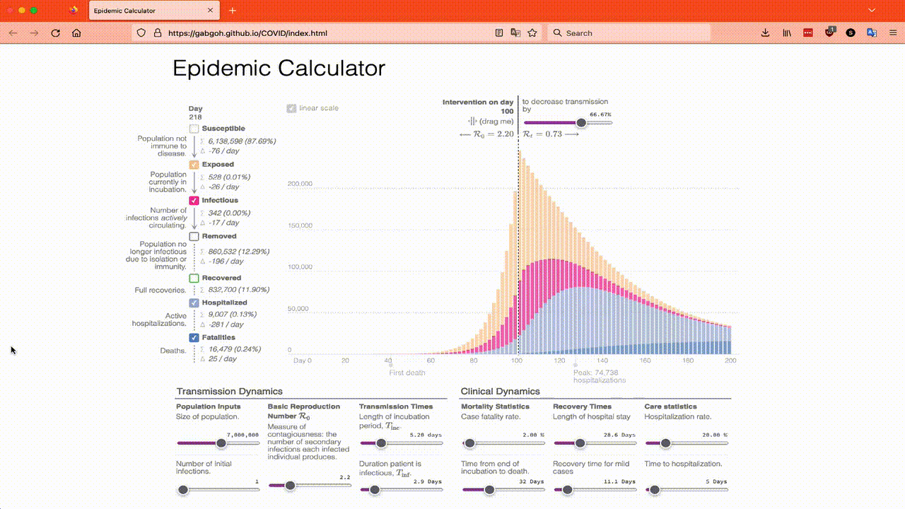
The online SEIR calculator is great if you know how much an intervention will affect R₀ by, but it is not so helpful if you want to look at things like a mask mandate where not everyone complies, so I’m going to have to use Lloyd’s translation of Program 2.6 as a starting point and in Part 4 I will modify the program to model a mask mandate.
So to start here’s the results of running the SEIR model using the parameters that match the online calculator’s defaults:


My model uses 1 day as the step size and predicts the maximum level of infectious will occur on day 127. The online calculator uses 2 days as the step size and says the maximum is on day 128 as you would expect if using a larger step size

When you are looking at peak like things such as these epidemic waves, it is helpful to try and describe them with a few numbers. To start with, there is the time when the peak reached it’s maximum level, which we just looked at. We could also look at just how high that maximum level is, but another important thing to measure is just how wide the peak is.
You might think that measuring the width of a peak is obvious, but the biggest problem is deciding when to start and stop measuring! For example, in the above graph, when does the peak start? Did it start on Day 60 when there are now 2 pixels visible? Did it start on day 80 when it starts to be noticeable? Scientists answer the question of how to measure the width of a peak by measuring the width half way up! This is called the Full Width at Half Maximum, or FWHM for short. Here’s an animation of me trying to measure the FWHM using the online calculator…

My model lets me get a more accurate measure of the FWHM and it says it’s 32.6 days for the same set of parameters which is in the range we estimated by eyeballing the online simulator.
In the next part of this series I will look at what happens to the FWHM of the infectious peak as we change R₀.
The reproduction number is how many people an infectious person would infect during the whole of their infectious period if they were exclusively in contact with susceptible people. In other words, if the infectious person had a “perfect” opportunity to spread the virus then they would likely infect this many people before they recover